After matching observations and model results into Comparer and ComparerCollection objects (as shown in the previous section), you can visualize these comparisons. ModelSkill simplifies generating standard validation plots, offering a more direct approach than manually creating them with Pandas and Matplotlib as covered in Module 2. This section demonstrates these built-in plotting capabilities for assessing model performance, both for individual comparison points and aggregated across multiple locations.
Show setup code for Comparer and ComparerCollection objects
# Source datasetsds_obs_source = mikeio.read("data/flow_meter_data.dfs0")ds_model_source = mikeio.read("data/model_results.dfs0")# Observation for 116l1obs_116l1 = ms.PointObservation( data=ds_obs_source, item="116l1_observed", name="116l1")# Observation for 12l1obs_12l1 = ms.PointObservation( data=ds_obs_source, item="12l1_observed", name="12l1")# Model Result for 116l1 from MIKE+mod_116l1 = ms.PointModelResult( data=ds_model_source, item="reach:Discharge:116l1:37.651", name="MIKE+")# Model Result for 12l1 from MIKE+mod_12l1 = ms.PointModelResult( data=ds_model_source, item="reach:Discharge:12l1:28.410", name="MIKE+")# Create Comparerscomparer_116l1 = ms.match(obs_116l1, mod_116l1)comparer_12l1 = ms.match(obs_12l1, mod_12l1)# Create ComparerCollectioncc = ms.ComparerCollection([comparer_116l1, comparer_12l1])
Comparer Plots
A Comparer (one observation vs. one model result) offers several plot types for detailed inspection.
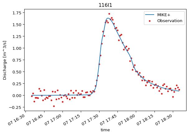
Time Series Plot
Overlays observed and model time series. Shows how well the model captures temporal patterns, peaks, and timing.
comparer_116l1.plot.timeseries()
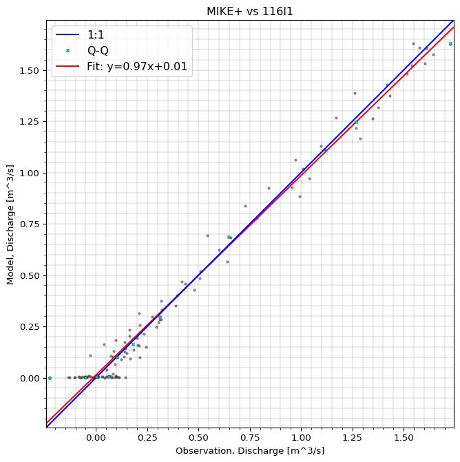
Scatter Plot
Plots observed values against model values. Points near the 1:1 line indicate good agreement. Helps identify bias or scaling issues.
comparer_116l1.plot.scatter()
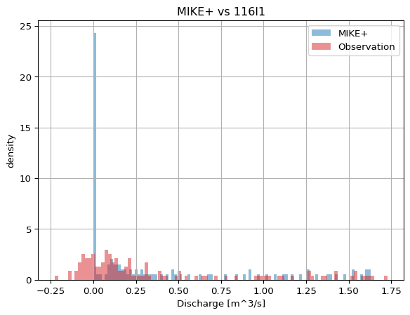
Histogram Plot
Compares frequency distributions of observed and model data. Shows if the model reproduces the overall value spread.
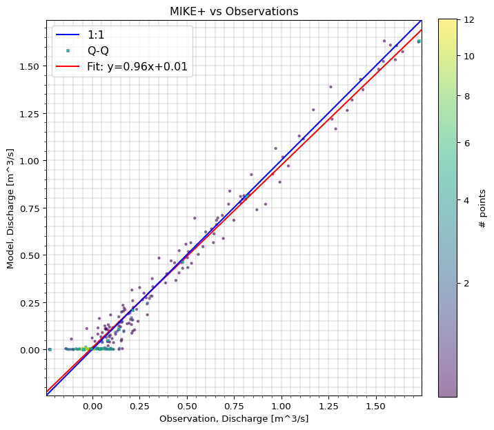
A ComparerCollection allows for aggregate plots, summarizing performance across all included comparisons. These aggregated plots are powerful because they give you a broader picture of your model’s performance across all your chosen validation points, rather than just looking at one location in isolation.
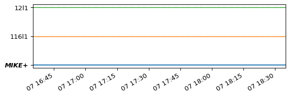
Temporal Coverage Plot
Shows the temporal data availability for each observation and model result in the collection, indicating periods of overlap and data gaps.
cc.plot.temporal_coverage()
Scatter Plot
Aggregates all (observed, model) pairs from the collection. This gives an overview of model performance across all locations, providing a holistic view of point-by-point agreement.
cc.plot.scatter()
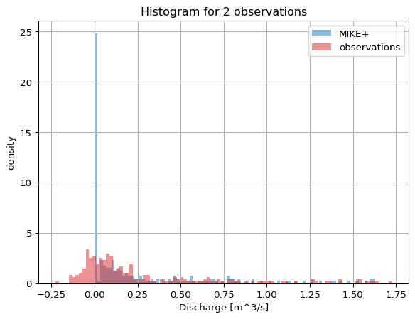
Histogram Plot
Combines data from all comparisons. This shows if the model matches the overall statistical profile of the observed data when considering all sites together.
ModelSkill plots are Matplotlib objects. Customize and save them using standard Matplotlib functions (e.g., ax.set_title("My Custom Title"), plt.savefig("my_plot.png")).
These plots offer a qualitative assessment of model performance. The next section will cover how to quantify performance using ModelSkill’s statistical skill scores.