df.head()| Model | Observed | |
|---|---|---|
| 1993-12-02 00:00:00 | -0.2689 | -0.219229 |
| 1993-12-02 00:30:00 | -0.2847 | -0.298526 |
| 1993-12-02 01:00:00 | -0.3020 | -0.237231 |
| 1993-12-02 01:30:00 | -0.3223 | -0.169997 |
| 1993-12-02 02:00:00 | -0.3483 | -0.371715 |
Visualizing time series data is a critical step in any MIKE+ modelling workflow. Effective plots can help understand data quality, model behavior, the agreement between simulations and observations, as well as communicating key findings.
Module 4 will delve deeper into creating plots and calculating statistics for model calibration and validation using the ModelSkill package.
Visual inspection of data serves several key purposes in the modelling process:
Before diving into plots, it’s often useful to get a quick numerical summary of your data.
Assuming you have a DataFrame df containing your time series with both observed and model data:
df.head()| Model | Observed | |
|---|---|---|
| 1993-12-02 00:00:00 | -0.2689 | -0.219229 |
| 1993-12-02 00:30:00 | -0.2847 | -0.298526 |
| 1993-12-02 01:00:00 | -0.3020 | -0.237231 |
| 1993-12-02 01:30:00 | -0.3223 | -0.169997 |
| 1993-12-02 02:00:00 | -0.3483 | -0.371715 |
The describe() method provides useful statistics of each column in the DataFrame.
df.describe()| Model | Observed | |
|---|---|---|
| count | 577.000000 | 577.000000 |
| mean | -0.005975 | -0.007724 |
| std | 0.219331 | 0.247389 |
| min | -0.501200 | -0.671723 |
| 25% | -0.136900 | -0.162345 |
| 50% | -0.000200 | -0.009162 |
| 75% | 0.124900 | 0.154040 |
| max | 0.510600 | 0.699579 |
This section showcases a few useful plot types for time series data in MIKE+ modelling.
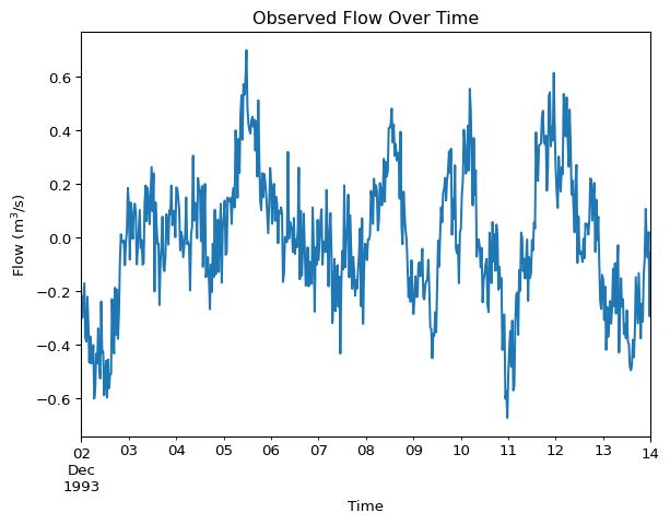
Line plots are essential for visualizing temporal patterns in hydraulic data like flows, water levels, or rainfall. They are also the primary way to compare simulated versus observed time series.
You can plot a single series directly from a DataFrame column:
df['Observed'].plot(
    title='Observed Flow Over Time',
    xlabel='Time',
    ylabel='Flow (m$^3$/s)'
)
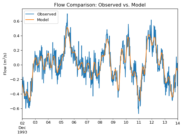
Compare two time series, such as observed and modelled flow:
df[['Observed', 'Model']].plot(
    title='Flow Comparison: Observed vs. Model',
    ylabel='Flow (m$^3$/s)'
)
This plot helps smooth out noisy time series data, such as high-frequency sensor readings for flow or water level. This smoothing can make it easier to visualize underlying trends or long-term patterns.
df['Observed_Rolling_Mean'] = df['Observed'].rolling(window=6).mean()

df[['Observed', 'Observed_Rolling_Mean']].plot(
    title='Observed 6-Hour Rolling Mean',
    ylabel='Flow (m$^3$/s)'
)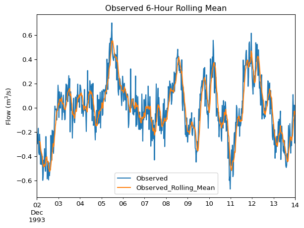
Adjust the window size in the .rolling() method to control the amount of smoothing. Larger windows result in smoother trends but might obscure shorter-term variations.
Scatter plots are particularly useful for model calibration. By plotting paired observed values against simulated values, you can assess point-by-point agreement.
ax = df.plot.scatter(
    x='Observed',
    y='Model',
    alpha=0.5, # so we can see overlapping points better
    title='Observed vs. Model'
)

# plot 1:1 line
max_val = max(df['Observed'].max(), df['Model'].max())
min_val = min(df['Observed'].min(), df['Model'].min())
ax.plot([min_val, max_val], [min_val, max_val], 'k--', label='1:1 Line')  # black dashed line
ax.legend()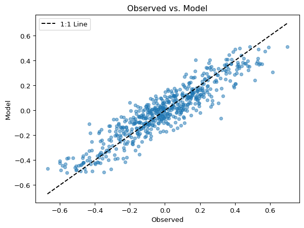
Points clustering around the 1:1 line (the dashed line in the example) indicate good agreement.
To understand seasonal variability in your data (e.g. diurnal or seasonal flow patterns), box plots can be effective.
df['Day'] = df.index.day_name()
ax = df.boxplot(column='Observed', by='Day')
ax.get_figure().suptitle("") # remove figure title, just use axes title
ax.set_title("Flows by Day of Week")
ax.set_ylabel("Water level (m)")
Text(0, 0.5, 'Water level (m)')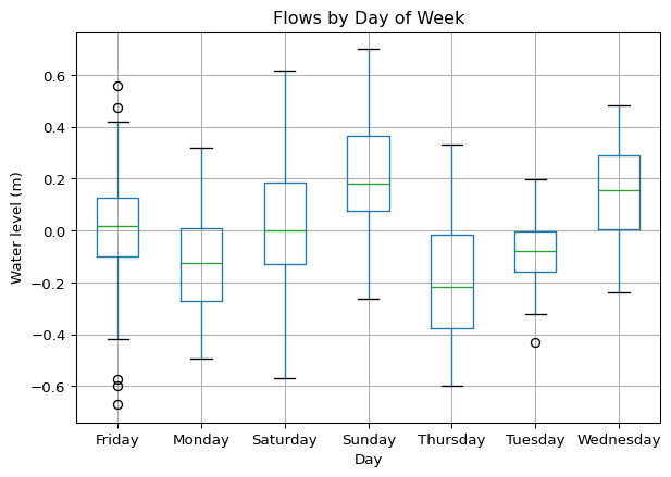
Cumulative sum plots are excellent for assessing overall water balance or comparing total accumulated volumes (e.g., rainfall, runoff) between observed and simulated data over a period.
df_discharge.cumsum().plot(ylabel="Cumulative Discharge (m$^3$/s)")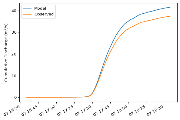
Cumulative sums for mass balance require calculating volume differentials. The example below is a simplified approach, recognizing they time series share the same time axis.
Histograms help you examine the frequency distribution of variables, such as water levels or flows. This can be useful for comparing the overall statistical profile of observed versus simulated data or understanding the prevalence of certain magnitudes.
df.plot.hist(bins=15, alpha=0.5)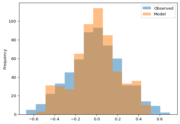
Similarly, review frequency distribution with KDE plots:
df.plot.kde()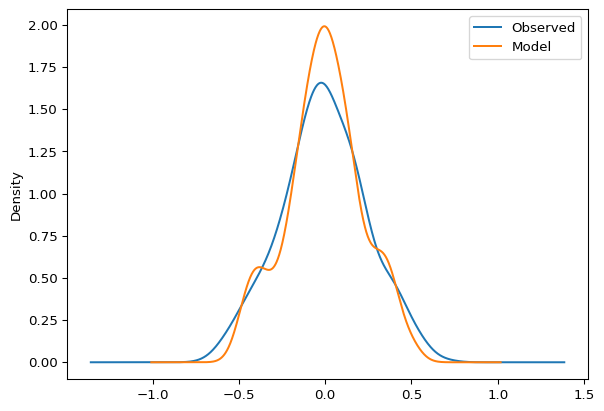
Easily save plots for inclusion in reports via plt.savefig().
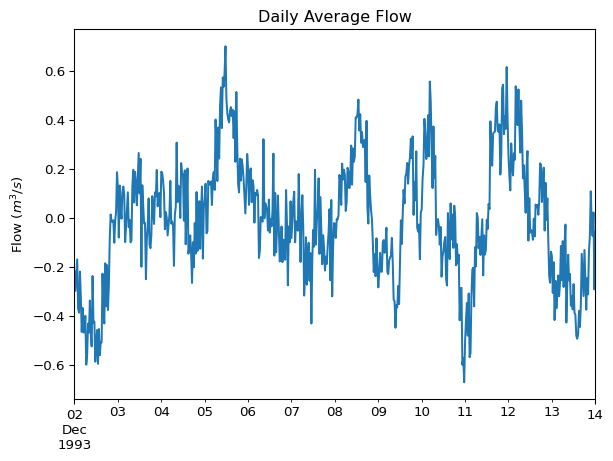
import matplotlib.pyplot as plt

ax = df['Observed'].plot(title='Daily Average Flow', ylabel="Flow ($m^3/s$)")
plt.savefig("my_plot.png")