Observation and model data
import modelskill as ms
o = ms.PointObservation('../data/SW/HKNA_Hm0.dfs0', item=0, x=4.2420, y=52.6887)
mr = ms.PointModelResult('../data/SW/ts_storm_4.dfs0', item=0) # TODO coordsPointObservations and PointModelResults can be plotted using their plot accessor:
import modelskill as ms
o = ms.PointObservation('../data/SW/HKNA_Hm0.dfs0', item=0, x=4.2420, y=52.6887)
mr = ms.PointModelResult('../data/SW/ts_storm_4.dfs0', item=0) # TODO coordso.plot.timeseries();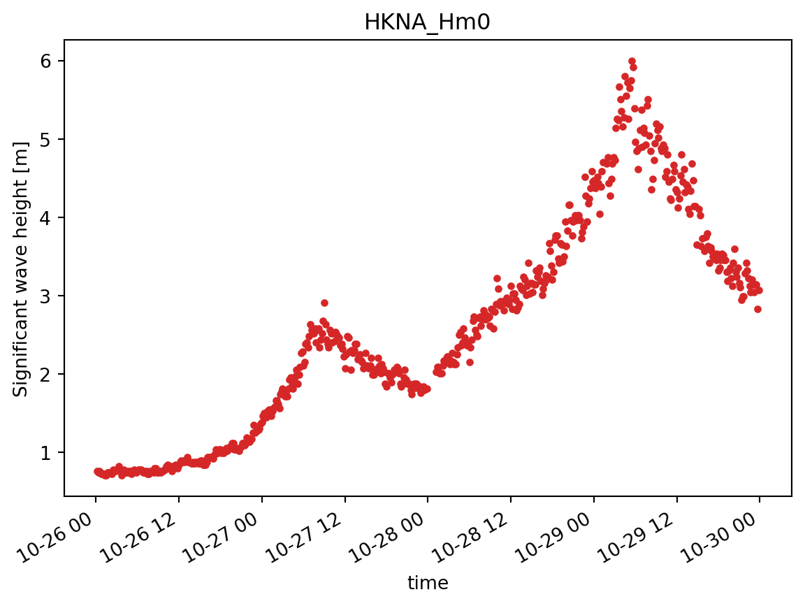
mr.plot.timeseries();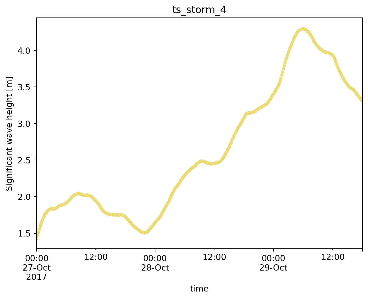
mr.plot.hist();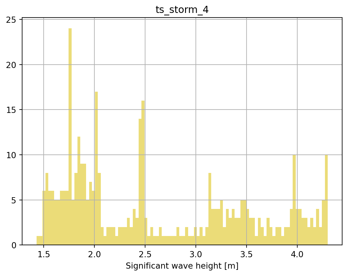
The temporal coverage of observations and model results can be plotted using the temporal_coverage function:
o1 = ms.PointObservation('../data/SW/HKNA_Hm0.dfs0', item=0, x=4.2420, y=52.6887)
o2 = ms.TrackObservation("../data/SW/Alti_c2_Dutch.dfs0", item=3)
mr = ms.DfsuModelResult('../data/SW/HKZN_local_2017_DutchCoast.dfsu', item=0)
With a few observation and model result objects, the temporal coverage can be plotted:
ms.plotting.temporal_coverage(obs=[o1, o2], mod=mr);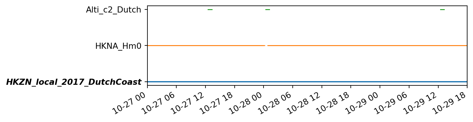
The spatial coverage of observations and model results can be plotted using the spatial_overview function:
ms.plotting.spatial_overview([o1, o2], mr);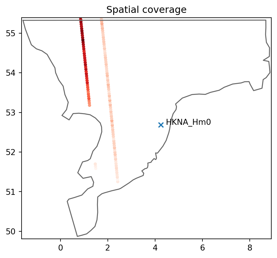
The plot accessor on a Comparer or ComparerCollection object can be used to plot the compared data:
cmp = ms.match(obs=o1, mod=mr)
cmp
<Comparer>
Location: 4.242, 52.6887
Quantity: Significant wave height [m]
Observation: HKNA_Hm0, n_points=386
Model(s):
0: HKZN_local_2017_DutchCoastcmp.plot.timeseries();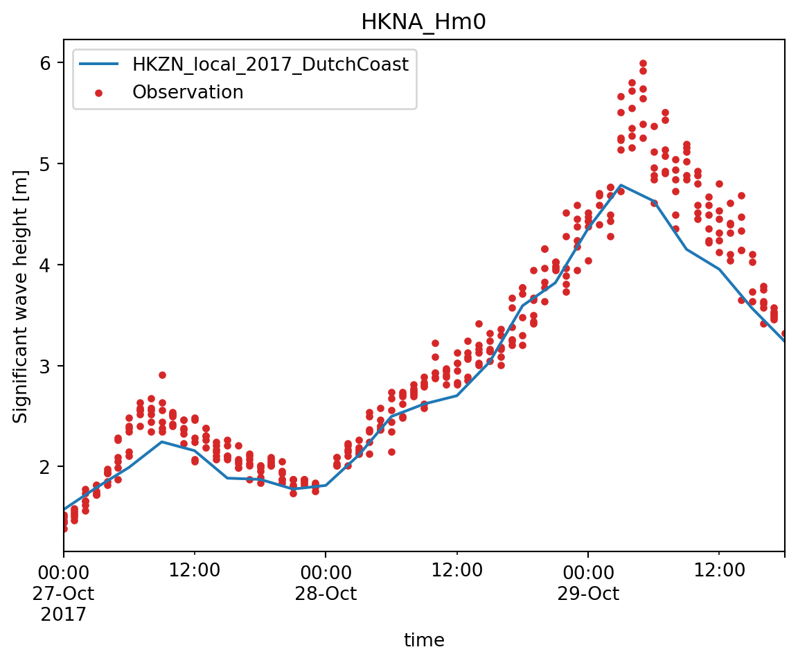
cmp.plot.scatter();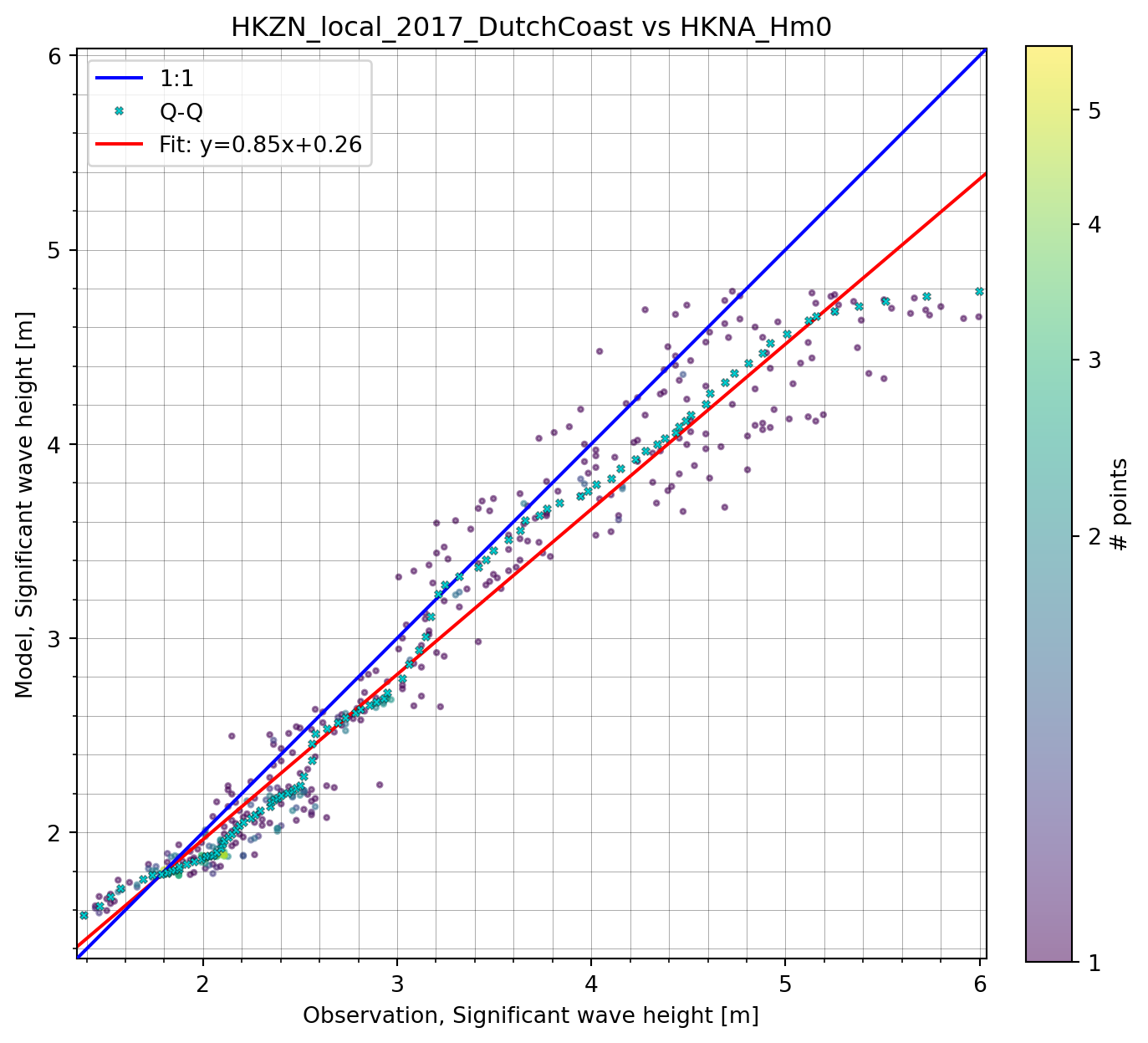
A Comparer holding vertical profile data (gtype="vertical") has an extra vertical accessor with depth-aware plots, available through cmp.vertical.plot.
The profile plot shows model and observed values against depth. It is meant for a single point in time, so select a time first:
vo = ms.VerticalObservation("../data/vertical/VerticalProfile_obs1.dfs0",
                            item="Salinity", z_item="z", x=657500, y=6553600)
mr3d = ms.DfsuModelResult("../data/vertical/sigma_z_coast.dfsu", item="Salinity")
vcmp = ms.match(vo, mr3d)

vcmp.sel(time="2022-06-15").vertical.plot.profile();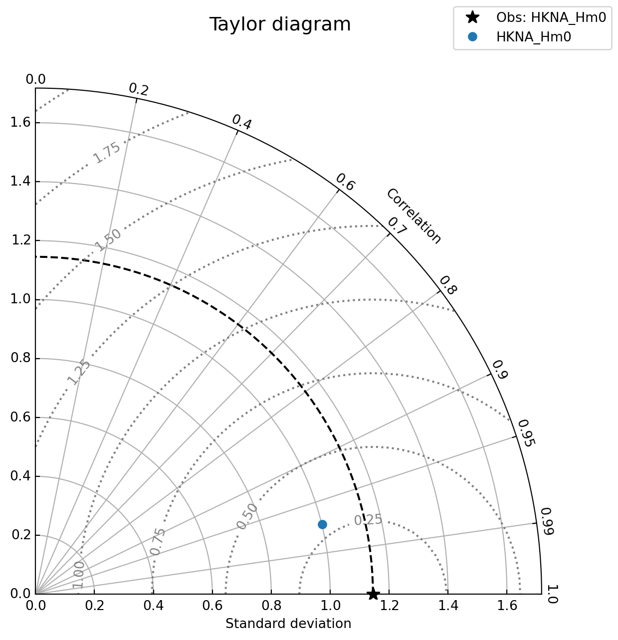
The model is drawn as a line (the full modelled column) and the observations as markers. Pass show_matched_model=True to also mark the model values interpolated to the observation depths. vertical.plot() is a shorthand for vertical.plot.profile().
The hovmoller plot shows the whole comparison as a function of depth and time, with the model as a filled contour and the observations overlaid as markers:
vcmp.vertical.plot.hovmoller(figsize=(12, 4));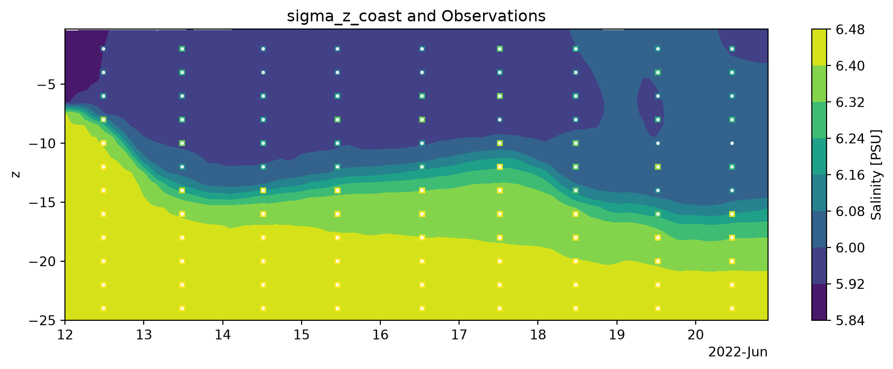
With more than one model result, the model to contour must be named explicitly, e.g. vcmp.vertical.plot.hovmoller(model="m1").
Skill computed in depth bins with vertical.skill() returns a SkillProfile, whose metrics can be plotted as a horizontal bar plot per depth bin:
sk = vcmp.vertical.skill(bins=4)
sk.rmse.plot();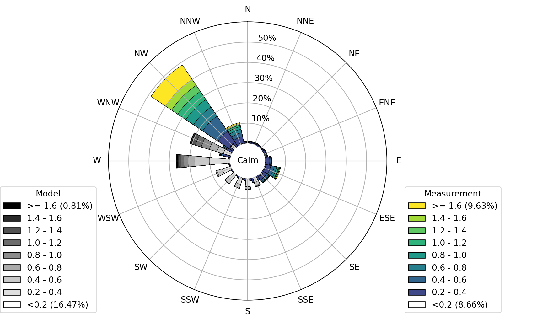
The bins can also be given explicitly, e.g. bins=[-20, -15, -10, -5, 0].
Note that all the ordinary Comparer plots shown above work on vertical data too; they simply ignore the depth dimension.
A Taylor diagram shows how well a model result matches an observation in terms of correlation, standard deviation and root mean squared error. The taylor plot can be accessed through the Comparer plot accessor or the ComparerCollection plot accessor:
cmp.plot.taylor()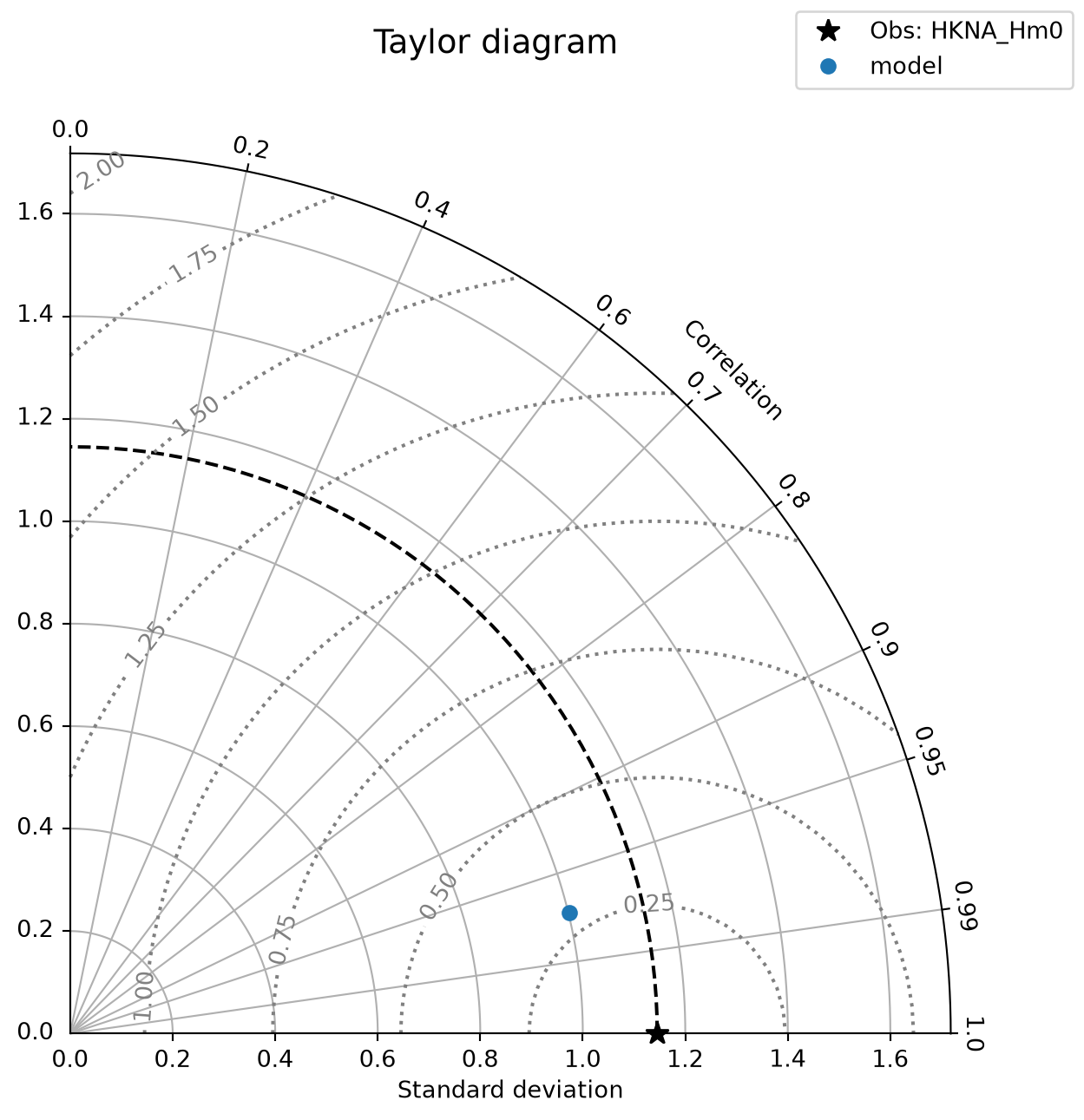
The radial distance from the point to the observation point is the standard deviation ratio, the angle is the correlation coefficient and the distance from the observation point to the model point is the root mean square error ratio. The closer the model point is to the observation point, the better the model result matches the observation. The closer the model point is to the origin, the better the model result matches the observation in terms of standard deviation and root mean square error. The closer the model point is to the horizontal axis, the better the model result matches the observation in terms of correlation.
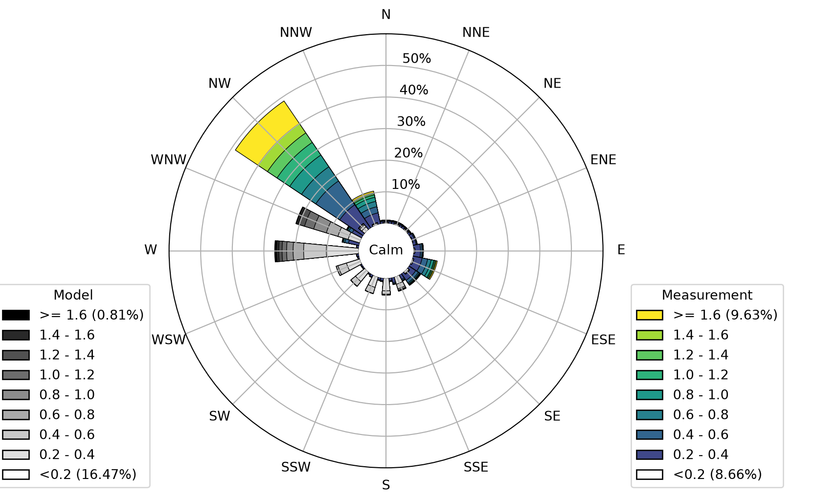
Directional data can be plotted using the wind_rose. The function takes an array-like structure with speed and direction as columns (from one or two sources) and plots a wind rose:
import mikeio
ds = mikeio.read("../data/wave_dir.dfs0")
df = ds[[0,2,1,3]].to_dataframe()
df.round(2).head()| China_Model: Sign. Wave Height | China_Model: Mean Wave Direction | China_Measured: Sign. Wave Height | China_Measured: Mean Wave Direction | |
|---|---|---|---|---|
| 2006-12-20 22:00:00 | 0.30 | 320.58 | 0.25 | 330.39 |
| 2006-12-20 23:00:00 | 0.43 | 316.24 | 0.23 | 329.59 |
| 2006-12-21 00:00:00 | 0.38 | 316.11 | 0.20 | 321.02 |
| 2006-12-21 01:00:00 | 0.37 | 315.34 | 0.18 | 311.00 |
| 2006-12-21 02:00:00 | 0.41 | 313.36 | 0.18 | 300.78 |
ms.plotting.wind_rose(df, figsize=(12,6));