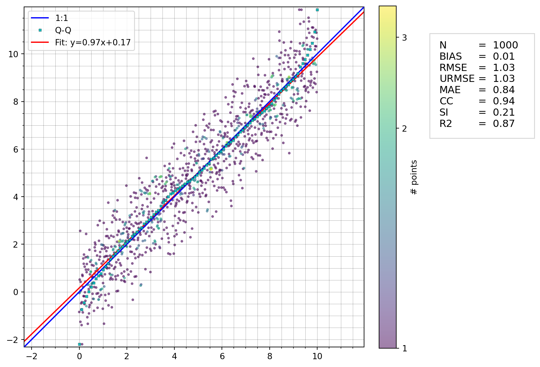
import numpy as np
import modelskill as ms
x = np.linspace(0, 10, 1000)
y = x + np.random.normal(size=1000)
ms.plotting.scatter(x, y, skill_table=True)
plotting.scatter(
    x,
    y,
    *,
    bins=120,
    quantiles=None,
    fit_to_quantiles=False,
    show_points=None,
    show_hist=None,
    show_density=None,
    norm=None,
    backend='matplotlib',
    figsize=(8, 8),
    xlim=None,
    ylim=None,
    reg_method='ols',
    title='',
    xlabel='',
    ylabel='',
    skill_table=False,
    skill_scores=None,
    skill_score_unit='',
    ax=None,
    **kwargs,
)
Scatter plot tailored for model skill comparison.
Scatter plot showing compared data: observation vs modelled Optionally, with density histogram or denisty color coding of points.
Note: can be called directly but is often called through the plot accessor on a Comparer/CompararCollection cmp.plot.scatter()
| Name | Type | Description | Default |
|---|---|---|---|
| x | np.ndarray | X values e.g model values, must be same length as y | required |
| y | np.ndarray | Y values e.g observation values, must be same length as x | required |
| bins | int | float | bins for the 2D histogram on the background. By default 120 bins. if int, represents the number of bins of 2D if float, represents the bin size if sequence (list of int or float), represents the bin edges | 120 |
| quantiles | int | Sequence[float] | None | number of quantiles for QQ-plot, by default None and will depend on the scatter data length (10, 100 or 1000) if int, this is the number of points if sequence (list of floats), represents the desired quantiles (from 0 to 1) | None |
| fit_to_quantiles | bool | by default the regression line is fitted to all data, if True, it is fitted to the quantiles which can be useful to represent the extremes of the distribution, by default False | False |
| show_points | (bool, int, float) | Should the scatter points be displayed? None means: show all points if fewer than 1e4, otherwise show 1e4 sample points, by default None. float: fraction of points to show on plot from 0 to 1. eg 0.5 shows 50% of the points. int: if ‘n’ (int) given, then ‘n’ points will be displayed, randomly selected. | None |
| show_hist | bool | show the data density as a 2d histogram, by default None | None |
| show_density | bool | None | show the data density as a colormap of the scatter, by default None. If both show_density and show_hist are None, then show_density is used by default. If number of points is less than 200, then show_density is False by default. For binning the data, the previous kword bins=Float is used |
None |
| norm | matplotlib.colors.Normalize | colormap normalization If None, defaults to matplotlib.colors.PowerNorm(vmin=1,gamma=0.5) | None |
| backend | str | use “plotly” (interactive) or “matplotlib” backend, by default “matplotlib” | 'matplotlib' |
| figsize | tuple | width and height of the figure, by default (8, 8) | (8, 8) |
| xlim | tuple | plot range for the observation (xmin, xmax), by default None | None |
| ylim | tuple | plot range for the model (ymin, ymax), by default None | None |
| reg_method | str or bool | method for determining the regression line “ols” : ordinary least squares regression “odr” : orthogonal distance regression, False : no regression line by default “ols” | 'ols' |
| title | str | plot title, by default None | '' |
| xlabel | str | x-label text on plot, by default None | '' |
| ylabel | str | y-label text on plot, by default None | '' |
| skill_table | str | Sequence[str] | Mapping[str, str] | bool | None | calculate skill scores and show in box next to the plot, True will show default metrics, list of metrics will show these skill scores, by default False, mapping can be used to rename the metrics in the table. Note: cannot be used together with skill_scores argument | False |
| skill_scores | dict[str, float] | dictionary with skill scores to be shown in box next to the plot, by default None Note: cannot be used together with skill_table argument | None |
| skill_score_unit | str | unit for skill_scores, by default None | '' |
| ax | matplotlib.axes.Axes | axes to plot on, by default None | None |
| **kwargs | {} |
| Name | Type | Description |
|---|---|---|
| matplotlib.axes.Axes | The axes on which the scatter plot was drawn. |
